

Search “best small business website examples” and you’ll get the same fifty screenshots recycled across a dozen blog posts. Clean fonts. Big hero images. A logo carousel of clients nobody’s heard of. Not one of those lists tells you why the site works, or whether it actually generates a single phone call. They’re graded like art, not like a machine that’s supposed to make you money.
That’s the problem. Pretty and profitable are not the same thing. I’ve watched business owners spend $8,000 on a redesign that looks polished on a laptop and converts worse than the plain Wix site it replaced, because nobody built in the parts that actually turn a visitor into a lead. The new site won a compliment. It didn’t win a client.
So instead of another mood board, here’s what’s actually happening on the small business website examples that generate real leads, what makes them work, and exactly what to steal for your own site this week.
The Real Problem With Most “Website Examples” Lists
Most website inspiration content is written by people who’ve never had to hit a lead number. They’re grading on typography and white space. A visitor doesn’t care if your hero section uses a nice serif font. They care about one thing: can they tell in five seconds if this business solves their problem, and is it obvious what to do next.
If you’ve ever wondered why so many small business sites don’t generate leads even though they look fine, this is usually why. The site was built to be looked at, not used. Nobody mapped the path from “landed on homepage” to “called the business.” Design got all the budget. Conversion got none of it.
What Actually Makes a Site Convert, Not Just Look Good
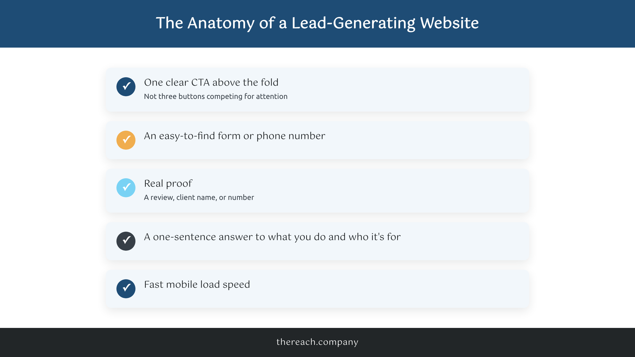
Strip the design opinions out and every small business website example that actually converts has the same handful of ingredients:
- A single, obvious call to action above the fold, not three buttons competing for attention
- A form or a phone number a visitor doesn’t have to hunt for
- Real proof: a review, a client name, a real number, not a stock photo of people in blazers shaking hands
- A homepage that answers “what do you do and who is it for” in one sentence
- A site that loads fast on a phone, because most of your visitors are on one
HubSpot’s research on lead-generating websites backs this up: readers’ eyes naturally move in an F-pattern starting top left, so primary calls to action placed inside that natural eye path convert better than ones buried below the fold or competing for attention. That’s not a design opinion, it’s how people actually read a page.
That last bullet, speed, is the one small business owners skip most. A slow site kills leads before a visitor ever sees your CTA, because they leave before the page finishes loading. On WordPress sites we set up WP Rocket and Perfmatters together, cache the pages, and strip out the plugin bloat that’s usually the real culprit. Most of the small business website examples that actually convert load in under two seconds on mobile. The gorgeous ones that don’t convert are usually running six tracking scripts and a slider plugin nobody asked for.
At The Reach Company we also wire lead capture straight into GoHighLevel on every site we build, so a form fill doesn’t just sit in an inbox. It triggers a text and an email follow-up automatically. The form matters more than the font.
The Contrarian Truth: The Fanciest Site Rarely Wins
Here’s the part nobody wants to hear: a tight 5-page site with a clear message almost always outperforms a sprawling 20-page custom build with a big price tag. More pages mean more places for a visitor to wander off before they convert, and more places for the message to get muddy.
I’ve watched a $299/mo 5-page site beat a $15,000 custom build for the same reason a good elevator pitch beats a rambling one. It says less, and what it says lands. Home, services, about, reviews, contact. That’s usually the whole thing a service business needs to start converting well. If your homepage needs a scroll and a half to explain what you do, that’s not sophistication. That’s friction, and every extra scroll is another chance for someone to leave.
Two Real Client Examples, With Real Numbers
Chin Up Aesthetics is the clearest small business website example I can point to. It’s a medspa, one location, competing against a dozen other spas in the same zip code with prettier logos than theirs. The site isn’t flashy. It’s built around one job: get someone who’s already interested to book a consult. Clear service pages, a review section that isn’t buried three scrolls down, a booking CTA that follows you down the page instead of hiding in a header nobody scrolls back up to find.
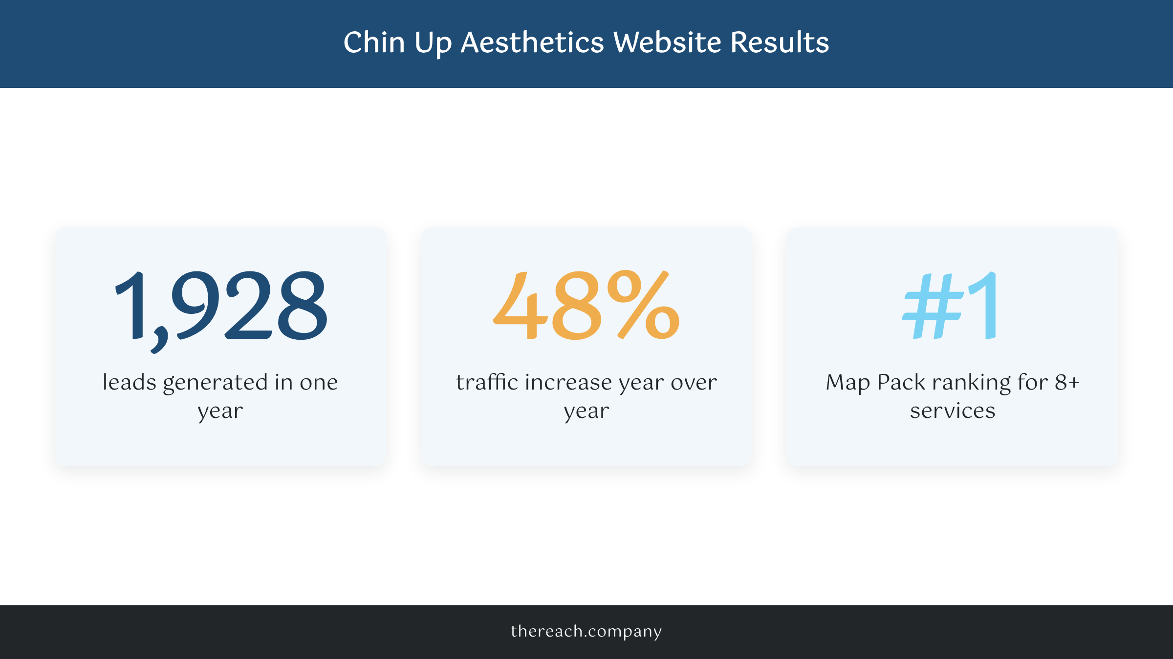
That single website generated 1,928 leads in one year and pulled a 48% traffic increase year over year, while ranking number one in the Map Pack for eight-plus services. Jewish Education Loan Fund is the other example worth studying, a nonprofit, five years into working with us. Their site redesign was part of a 54% increase in conversions and a 52% conversion rate on their first online event landing page. Neither of those sites won a design award. Both of them make money, and that’s the only award that pays the bills. That pattern holds outside those two as well. A megachurch site redesign doubled traffic in a single month, and a metro spa saw a 58% jump in booked appointments, neither one winning a design award, both built to move someone from curious to committed.
What to Steal for Your Own Site This Week
You don’t need a rebuild to apply any of this. Pull up your own homepage right now and check:
- Is there one clear call to action above the fold, or three fighting each other?
- Can a visitor find your phone number or a form in under five seconds?
- Does your homepage say who you help and what you do in one sentence?
- Do you have at least one specific number or named client as proof, not just “trusted by many”?
- Does it load fast on your own phone, on your own cell signal, not just on office WiFi?
If the answer is no to more than one of those, that’s your punch list before you touch anything else. Fix the biggest gap first. And if you want the form fills to actually go somewhere instead of dying in an inbox, that’s exactly what a lead generation system built into the site itself is for. GoHighLevel handles the follow-up so no lead falls through the cracks while you’re busy running the business.
The finish line here isn’t a redesign. It’s a homepage that does five things well instead of twenty things halfway. Audit your own site against the checklist above, fix the biggest gap first, and you’ll see the difference before you spend a dollar on ads to drive more traffic to it. You got this.

